Blue is the New Green - Summary
Below are a series of demographic maps that show a remarkable correlation of both financial and socio-economic metrics to the Presidential Election Electoral Map of 2004. Financial metrics such as Gross State Product, Per Capital Income, Federal Taxes Paid vs. Received, Number of State Employees, Charitable Giving as well as socio-economic metrics such as College Education, Crime Rate, Infant Mortality Rate, Obesity Rate, and Divorce Rate are presented in a blue-red gradient, where blue is better and red is worse.
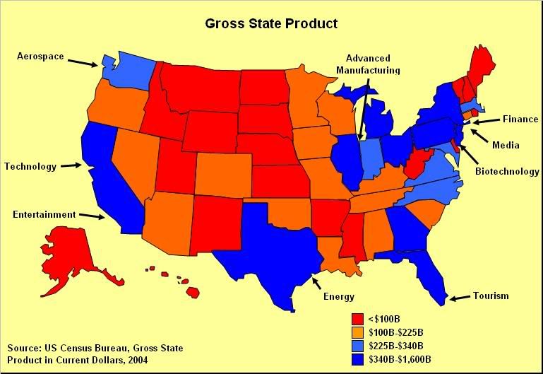
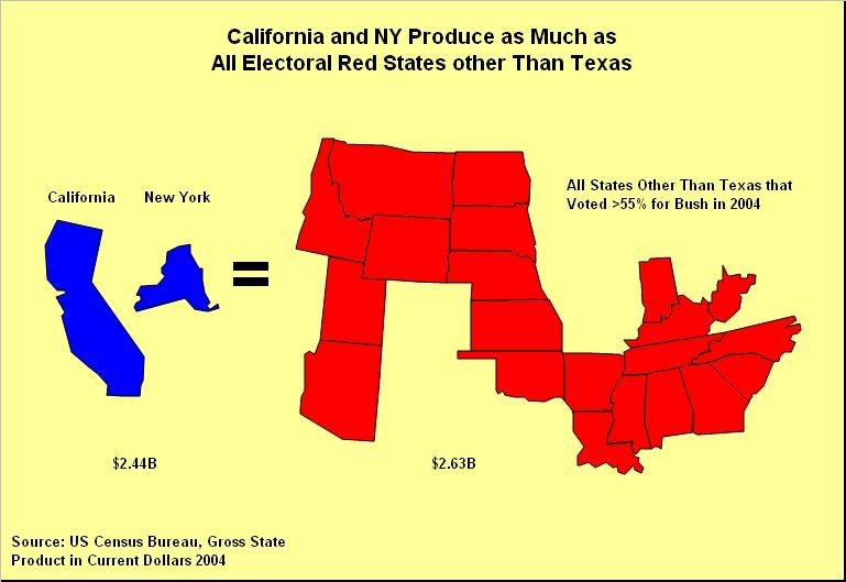
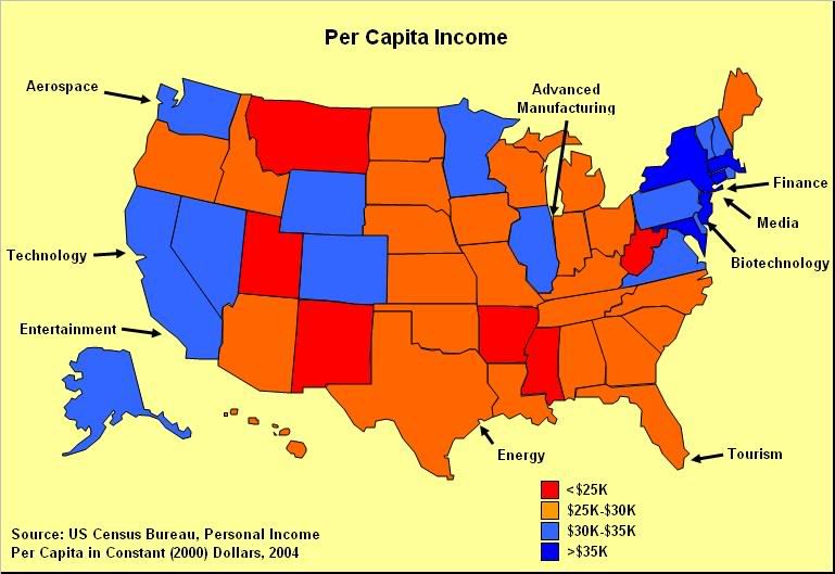
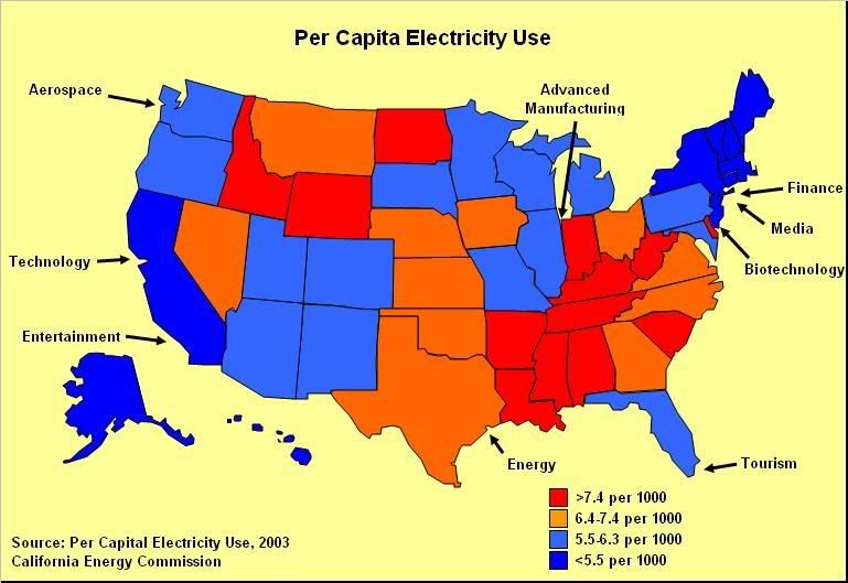
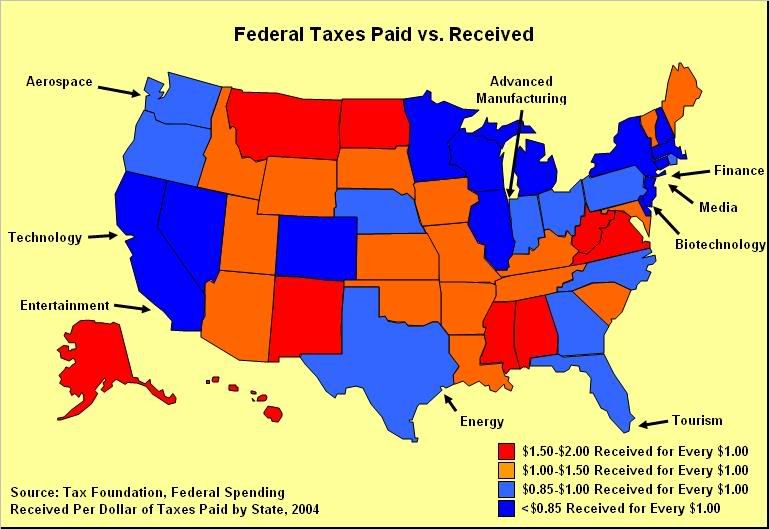
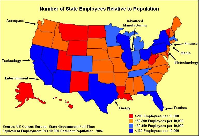
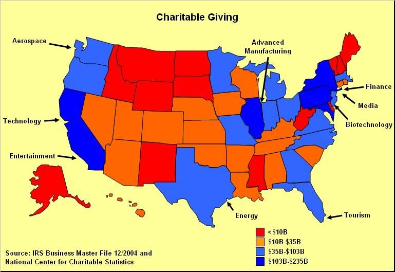
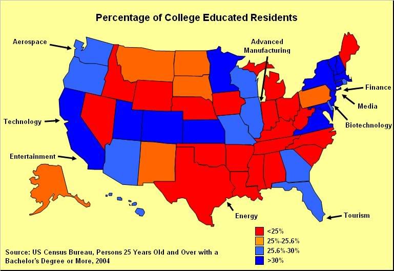
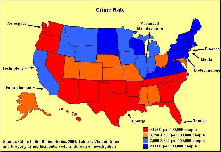
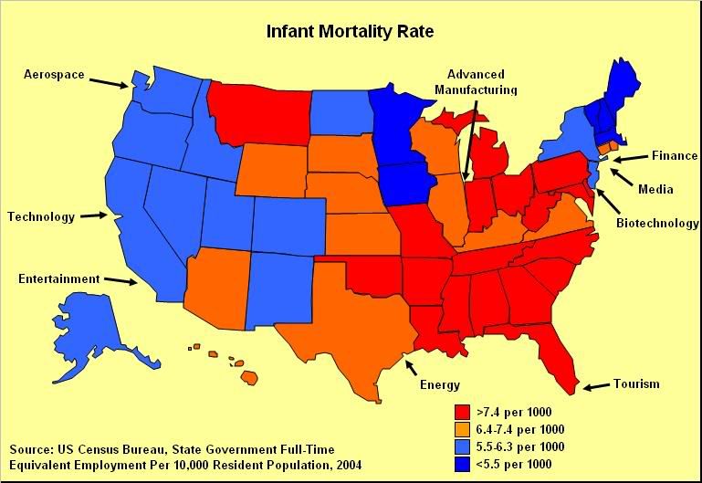
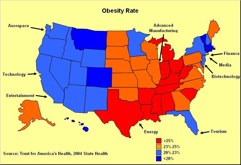
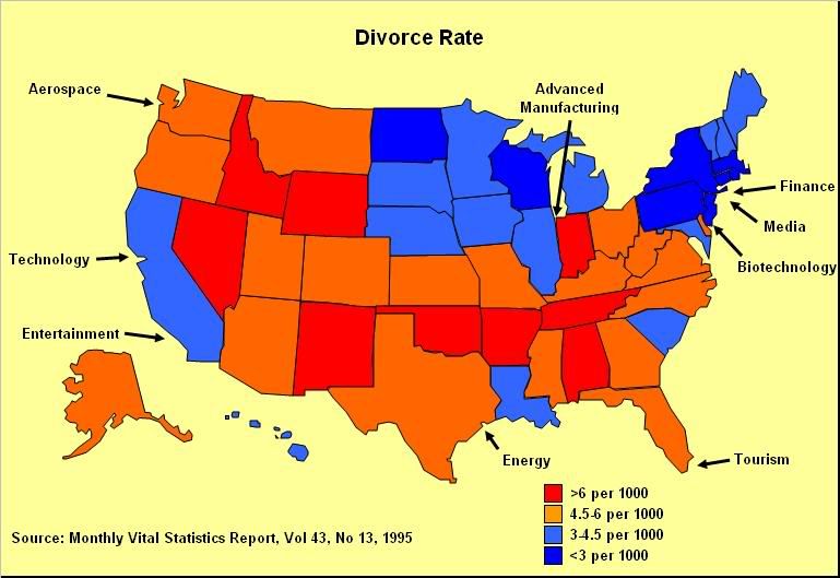
The data, most of which comes from the Federal government, shows that the "Blue States" host the most competitive industries, make most of the wealth in the United States, subsidize the "Red States" with Federal taxes on their wealth, use less electricity, run more efficient state governments, are better educated, and have a better quality of life. For a complete article explaining these maps and the data, please refer to the previous post on this blog.
Clearly, blue is the new green (as in dollars).
In the following maps, data is presented as blue is better and red is worse (other than the electoral map where better/worse is a matter of perspective!).
 |  |
 |  |
 |  |
 |  |
 |  |
 |  |
 |  |
posted by Peter Yared at
3:20 PM
![]()


0 Comments:
Post a Comment
Subscribe to Post Comments [Atom]
<< Home